
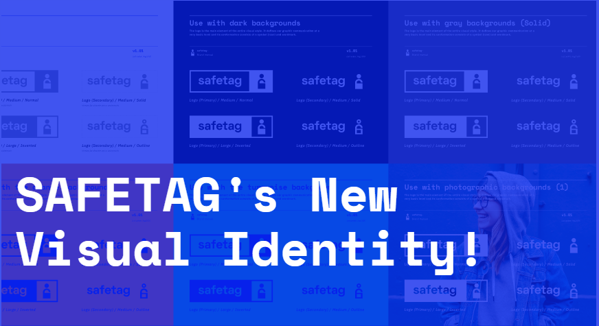
Over the past year, Internews has worked closely with Tafka Co-op, Development Seed, J++ and the SAFETAG community to create a new visual identity and web interface that is more user-friendly, interactive, and community-focused.
Through a series of open calls, a community survey, and input from Internews partners, we received feedback from over 25 SAFETAG auditors around the globe used to inform the new design. The feedback we received made it clear that one of the most important values of SAFETAG is the community-driven focus and we hope that this new visual identity and web interface encapsulates that aspect.
New logo and design assets
 As part of the new visual identity, Tafka Co-op worked with Internews and the broader SAFETAG community to update and/or create the following assets:
- Updated logo, shown above
- New color palette
- New iconography set
- New customizable graphics
- New accessibility guidance
- Sample presentation slides
- Sample print configurations
One of our priorities when redesigning the SAFETAG interface was to make the framework more usable. A lot of the feedback received showed that new auditors had trouble following the framework, knowing where to begin, how many activities to use in their audit, etc. In response to this, we developed new iconography which will help guide auditors through the interface and framework based on their needs. A total of 20 icons were developed, however the three that will be used to represent each type of activity are shown below.
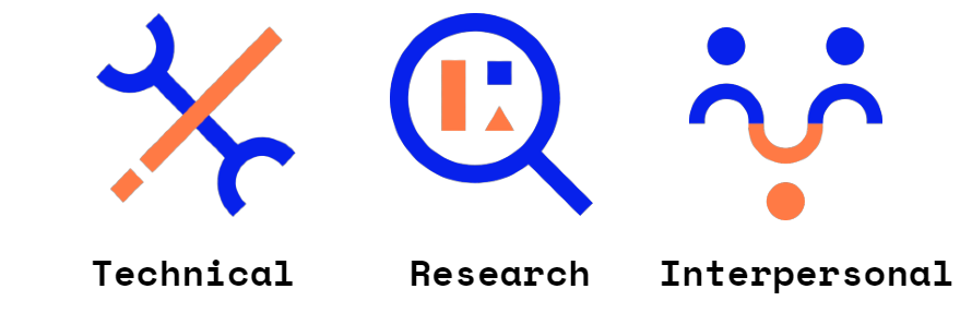
Each SAFETAG audit is custom-built to the needs of the organization which is being audited. Designed with this in mind, the logo and all icons were built using a series of shapes and colors, or elements, arranged to represent each activity. These elements are used as building blocks, combining to form each icon.
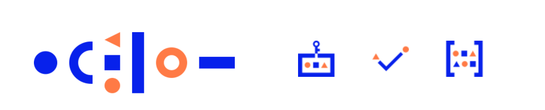
Basic shapes are configured to represent methods and activities such as Physical Assessment, Responsive Support, and Organizational Device Usage.
Individually, each shape represents a specific element of SAFETAG (such as data, organization, individual, etc.), and when configured together, represent a larger concept or method (such as Organizational Device Usage or Physical Assessment).
We are prioritizing a community-driven approach by hosting these assets on Figma, a platform that is free to use and allows full customization of the design assets. You can explore the icons and customizable design assets here*.
New SAFETAG Interface
In addition to the new visual identity, we have been working with Development Seed and J++ to build a new SAFETAG interface that is easier to use and more accessible for both new and experienced auditors. Learn more about the new interface here.
*A full documentation package with guidance on how to navigate the design assets is forthcoming.